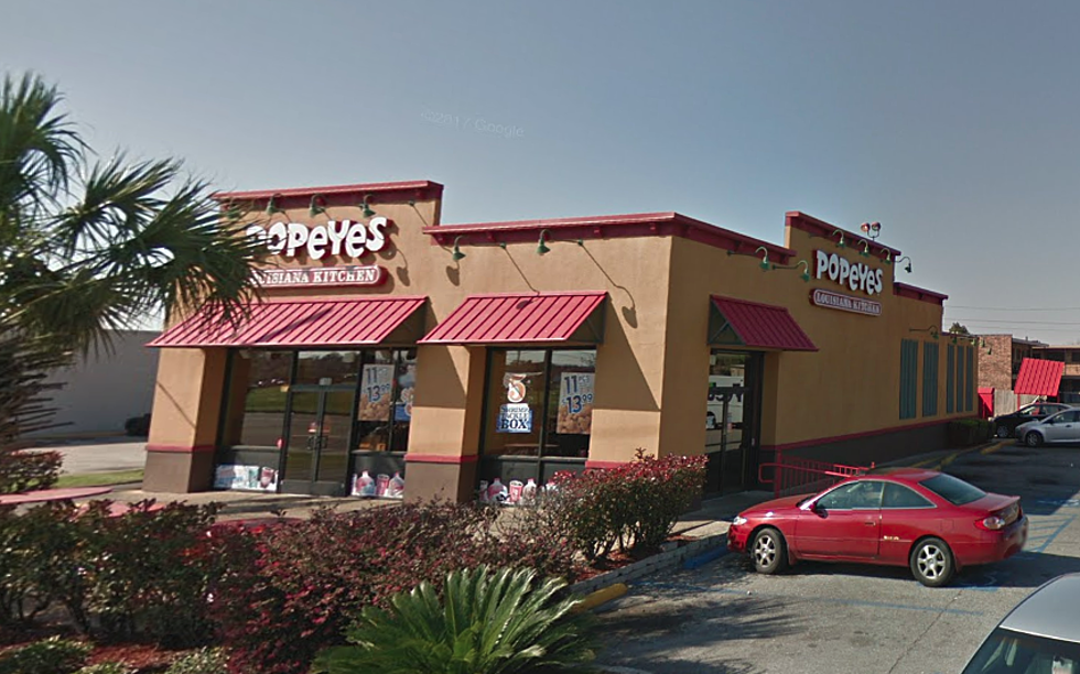
Have You Noticed Popeyes Changed Their Logo?
If you've been to Popeyes recently, you may have noticed something was different. At first, maybe you couldn't quite put your finger on it, but you could tell something was different. Well, you were right.
Popeyes Fried Chicken has recently changed their logo to a more streamlined, "digital friendly" font according to adweek.com. As you'll see in the side-by-side below, the new logo's letters are more uniform than the old logo's more cartoon looking letters.
So, why the change?
Popeyes has announced that they are expanding globally, opening up restaurants Brazil, Spain, China and more. The new streamlined logo is an effort to reflect a more mature brand, and also makes it easier to properly reproduce in other parts of the world.
From adweek.com -
"Last year’s chicken sandwich wars launched Popeyes Louisiana Kitchen to a new level of growth that even a pandemic couldn’t stifle. Now, the fast-food chain is revealing a brand refresh to go with its newfound celebrity status."
Nine Memes Only People From Acadiana Will Understand
10 Things Cajuns Do That Confuse The Rest Of The Country
Seven Crazy Louisiana Town Names Explained
More From 97.3 The Dawg


![New York Food Critic Tries Boudin, Fried Alligator and More at Lafayette Restaurants [Video]](http://townsquare.media/site/33/files/2021/05/Mikey-Chen-4.jpg?w=980&q=75)


![Popeyes Is Selling ‘Emotional Support Chicken’ To Relieve Holiday Stress [Video]](http://townsquare.media/site/34/files/2018/03/GettyImages-643471714.jpg?w=980&q=75)
